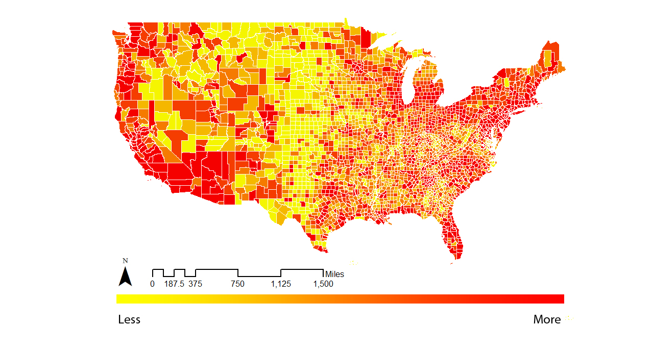
This map shows the population distribution in the United States by counties. The data source is the U.S. Census Bureau, 2012-2016 American Community Survey 5-Year Estimates. The map shows the true information of the total number of population in each county. However, it misleads people to use this map identifying where is the most popular place for people to live. Since different counties have different area, the population number cannot tell the whole story. Then Let's see the Area Map for the Area in each county.
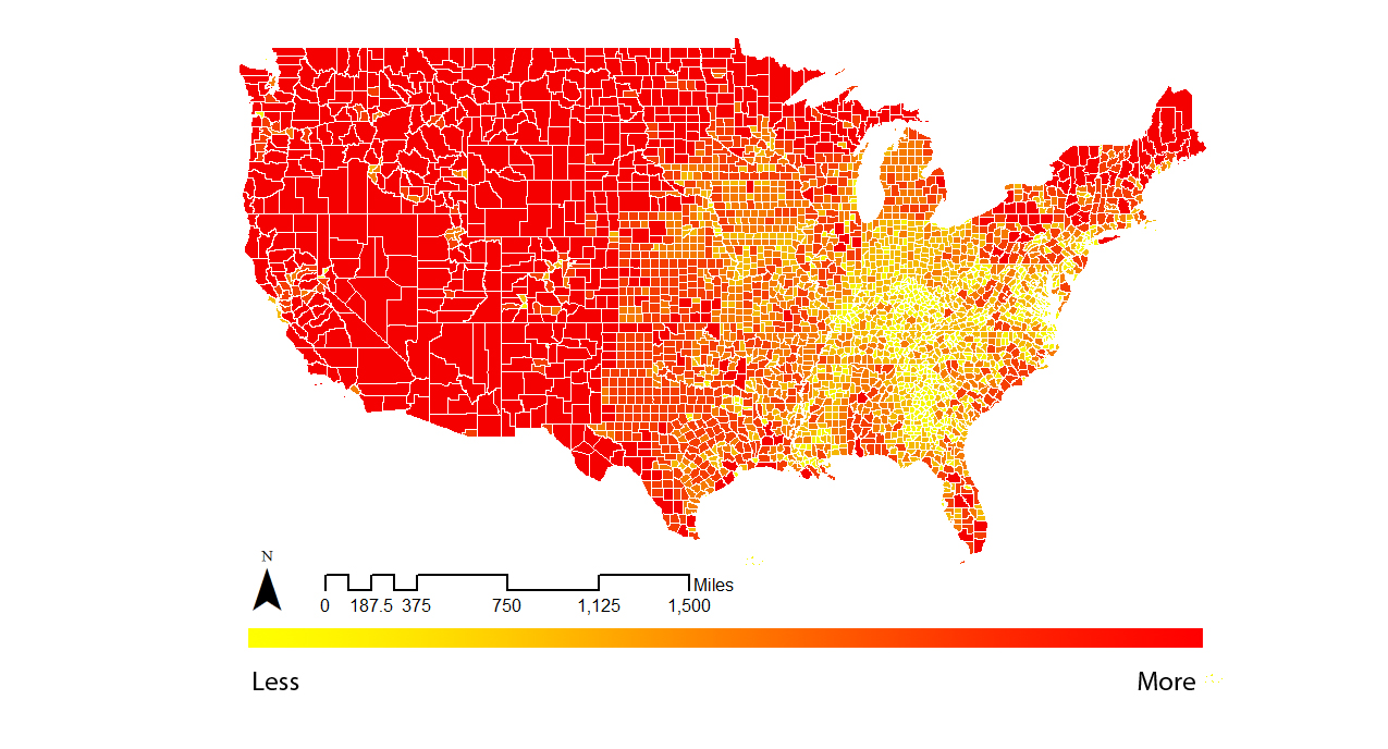
This map shows the area for each counties. The shapefile is issued by the Census Bureau's MAF/TIGER geographic database. From this map, we can see that there are huge differences among these counties. The county with largest area is the Yukon-Koyukuk county, which has 550023913 acres. The county with the smallest area is the Rose Island, which has only 26 acres. So it is better to present this information by population density, which calculated in the way of "population/area". And the map below shows the population density.
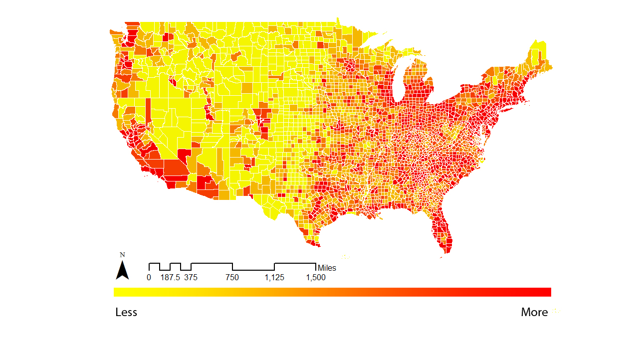
For example, through the population map, the Elko County has a large number of population. But it also has a large area. So in this map, we can see that the hotspots disappeared in this county. The following GIF shows the difference between this two map.

From the GIF, we can see that although the counties in the east part of the map is not changing too much, the counties in the west part of the map change a lot. The reason is that the counties in the west areas have larger area. So it is a matter of course that there are more population. But when we divide it by area, the population desnsity shows the truth about the living environment.